
QUESTBORNE
Questborne is a VR action adventure Virtual Slice developed for the Oculus Quest 2 over the course of twelve weeks.
As lead UX|UI designer I tasked myself with creating a fully diegetic User Interface for this project, Creating a fully immersive experience that would be easily accessible to new players and conducted extensive research into how to minimise frequent UX issues within VR as a medium, motion sickness, physical strain etc.
Outside of UX|UI I also lent a hand out to other departments such as Level Design, Asset Development and Programming to help with some of the loads during development.
Work & Responsibilities
-
Overseeing the team and establishing a pre-production schedule.
-
Assessed how to better the overall user experience within a VR space via extensive User Research & surveying key UX principles within the current VR market.
-
Conducted weekly usability tests with players to gather critical player feedback for each weekly update on the project.
-
Designed & Deployed a fully diegetic UI for the project.
-
Experimented with creating interesting new UI elements that take full advantage of VR as a medium.
-
Created User Flow Diagrams, Journey Maps & Wireframes to Visualise game features and ideas.
-
Implement Key UI & UX deliverables in engine.
Tools & software


You can find The Full Production Blogs
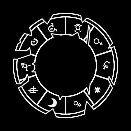
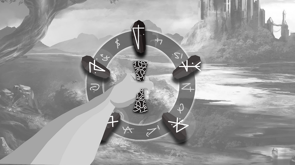
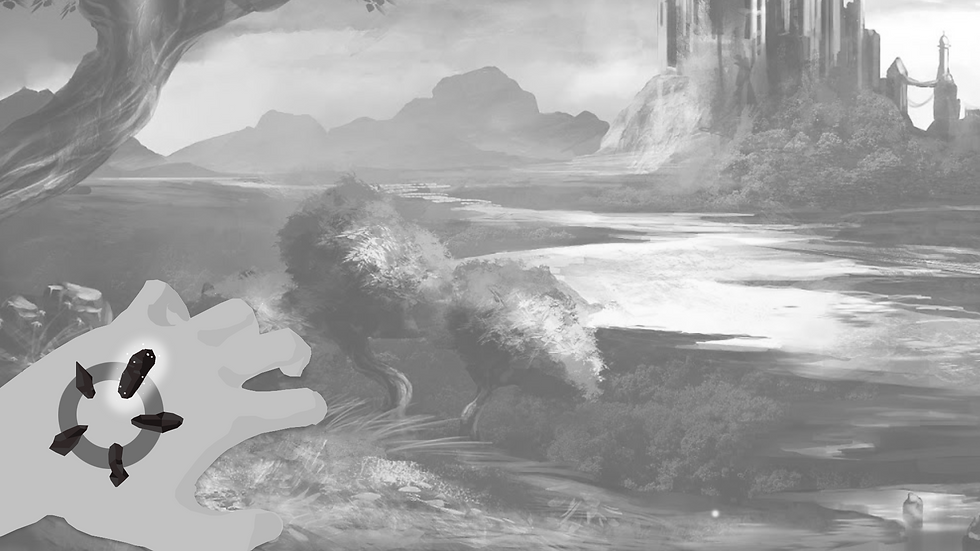
Magic Select MENU
* Development Video
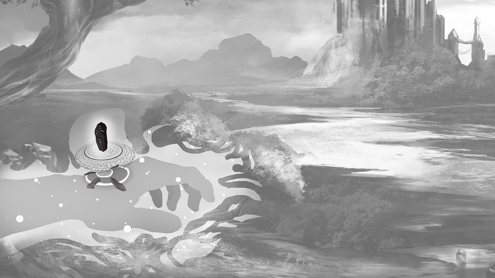
The magic selection menu was the UI feature that I spent the longest developing and tweaking to get right as it went through multiple iterations and was overhauled completely from it's original design.
The above video shows exactly how the menu worked in it's final stages but when I initially started development I outlined some development targets that the menu had to hit. The Menu had to:
-
Be unique and interesting for the player to use
-
Be accessible at all times during gameplay
-
Provide the user with visible feedback on cooldowns
-
Help further the players immersion in the world
-
Be fully diegetic
SHIELD SELECTION
* Development Video
One of the key issues we ran into during playtesting was how overwhelmed they player would get when facing multiple ranged enemies, So we needed to implement a "shield" of some kind. A tool that the player could have easy and quick access too and bring out if they were in a tight spot.
When it came to designing this feature I thought of adding a normal shield the player could hold, however this came with issues as the player could drop or loose their shield and be defenceless, So we needed something that could be accessed at all times by the player. This is when I designed it so the shield would be intertwined with the magic selection menu.
The final design of the shield allowed the player to:
-
Access the shield at any point and at any location
-
Defend themselves while still having access to their powers
-
Have agency to choose between defence and ranged offence or defence and close quarters offence
-
Most importantly feel impactful to use


* Shield Damage Stages
Wireframes
A sample of the High Fidelity wireframes I created in Adobe XD to present and visualise how the mechanics should look from the perspective of our player to the team.


OLd Magic Selection
Below is what the magic selection looked like In it's early stages. It had to be reworked as during playtesting sessions, player feedback indicated that they system felt too "finnicky" and took to long to activate their magic in a combat scenario.
So I needed to:
-
Reduce the amount of steps it took to activate magic
-
Make the system have more room for error and less of a skill ceiling.
-
Create a selection system that had better affordances and conformed to common UI menu's

* Old Magic Selection System
User Journey - Old System
Wait for crystal to charge
Pick crystal from hand
Hold Crystal
Place Crystal into slot
Activate Magic
User Journey - Improved System
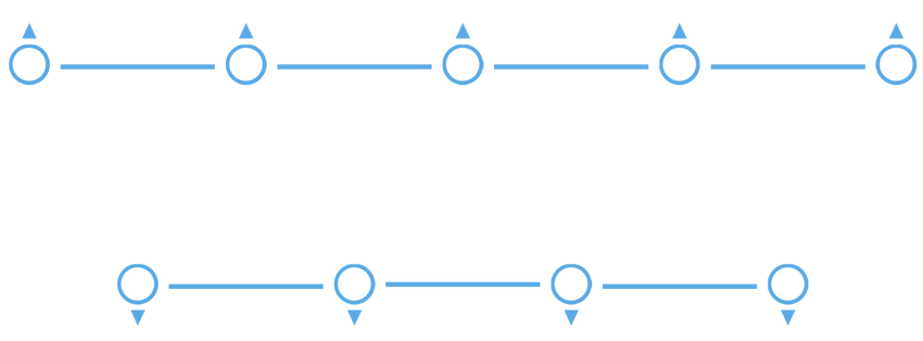
Spawn Menu
Pick out crystal
Crush Crystal
Magic Activates
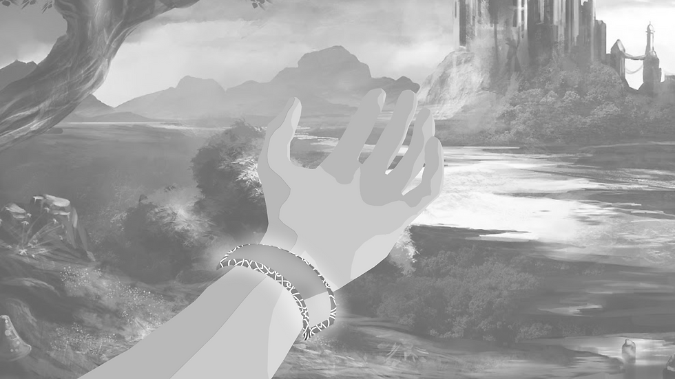
Health bar Braclet
*Early Development Video
One of the challenges I had to overcome was displaying the players health while still keeping to the design goal of having a fully diegetic UI.
After conducting several Heuristic usability tests, I kept on missing the mark on letting the players know when they were low on health as during combat it was a pain to have to look at your wrist to see if you were about to die and many players died without realising their health was low
i wanted to avoid a typical "Red Screen" effect as that would break the immersion in VR so to allow the player to understand when they were low on health I added a low rhythmic haptic feedback rumble to the controller to mimic a heartbeat and to alert the player to their low health without having to look at their wrists.