

Personal Project
Valorant is a team-based tactical first-person hero shooter set in the near future.
Players play as one of a set of Agents, characters designed based on several countries and cultures around the world.
Valorant is currently one of my favourite franchises so this project was an absolute blast to create, I wanted to make sure that my passion came through in this project by creating a very polished end product.
I created and optimised designs of the agent select screen and the player HUD on mobile based on my own research and knowledge of User Research & Usability, interaction Design, Service Design and Information Architecture. Making sure to create designs that allow for the best user experience for both veterans of Valorant and newcomers to mobile gaming.

Work & Responsibilities
-
Using Information gathered through User Research translate into actionable UX goals.
-
Conducted user research into market competitors to better understand how to improve the product
-
Create and develop user flows, post it investigations & hand drawn wireframes
-
Iterate and develop low and high fidelity wireframes based on user feedback.
-
Support High level design in developing intuitive control schemes and workflows
-
Create a Fully interactive prototype within Adobe XD, demonstrating user & design goals
-
Implement final design in engine
Valorant MOBILE
Tools & software


You can find my in depth research board
Prototypes & Results
Below are the finalized versions of the "Agent Select" Menu & both the "Advanced" HUD as well as the "Basic" version, Each prototype was heavily iterated upon through each stage of development from scamps to high fidelity. I successfully,
-
Created the information architecture for each screen
-
Optimized screens for mobile while still keeping all existing necessary information from PC Valorant
-
Optimized and reduced the steps taken in the user journey to make it as efficient as possible
-
Created multiple control options for different users to make the overall product more accessible to a newer & experienced audience
-
Conducted Extensive User Research into the target audience back each design decision made
Agent Select Prototype
*Agent Select Interactable prototype
Advanced Controls prototype
*Advanced HUD Interactable prototype
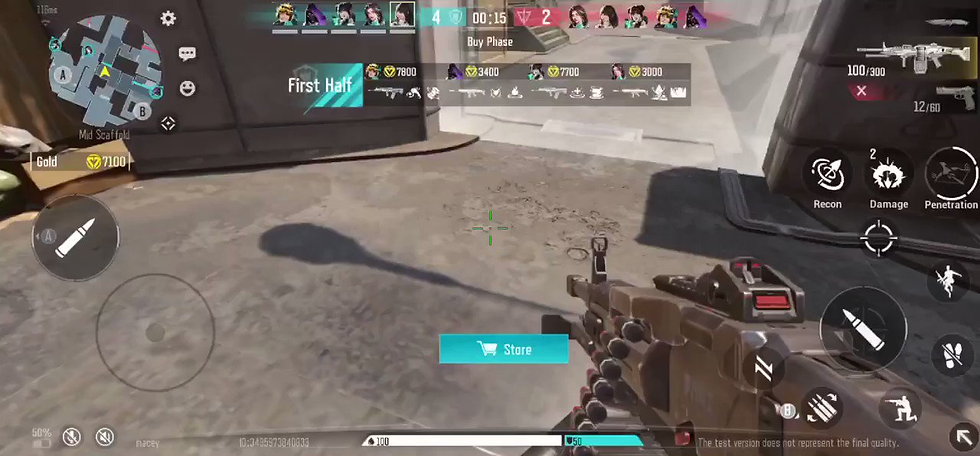
The advanced controls was designed for a user that already has come to grips with the controls and is wanting the most optimal/ meta experience possible when playing. With the player's abilities being hidden it allows for less clutter and better in game visibility, While a collapsible menu also allows users to quickly flick to certain abilities.
The button positioning on the right and left hand side of the screen fit within a comfortable position for the player's thumbs while still leaving enough space to fully aim and view the screen without the users own hands obscuring gameplay
basic Controls Prototype
*Basic HUD Interactable prototype
basic Controls (Alt) prototype
*Alternate HUD Interactable prototype
The reason for having an alternate design for the basic HUD is that while similar each one prioritises a different mechanic for resting in the best position for a players thumb. The basic UI allows for a more comfortable experience when selecting abilities while pushing the players ability to control where they look more to the centre of the screen.
While the alternate version allows for a much more comfortable aiming experience but some of the abilities may feel uncomfortable or hard to reach for the player. In a development scenario it would come down to playtesting and conducting usability tests to see which give the best user experience
User Personas
When designing & transferring a concept of an already existing IP to a new system it is vital to both understand the audience of the IP and the audience of the system that is being ported to. This allows us to best blend the needs and wants of Valorant players with the existing expectations & conventions of Mobile FPS players understanding who they are and what they know.
Here are some of the users through research I felt would be using the product, their knowledge and motivations. When developing for Valorant Mobile, much like any product we will have users with varying degrees of experience and knowledge with both Valorant and mobile gaming, so it is vital that we take all the information into account so we can empathise with the target audience & develop the best user experience possible.

Sarah

Norman

Mike
-
Streams Valorant Multiple times A Week
-
Has a great understanding of the ins and outs of Valorant
-
Takes gaming as a casual and competitive activity
-
New to Mobile Gaming Limited knowledge of mobile gaming conventions
-
Has a great amount of experience in mobile gaming
-
Does not play on PC as mobile is more affordable/ accessible
-
No experience or knowledge with Valorant or its mechanics
-
Has been wanting to get into Valorant now that it is coming to mobile
-
No experience with Valorant or Mobile Gaming.
-
Takes Gaming as a very casual activity
-
Limited knowledge of common UI themes and layouts within mobile games
-
No knowledge or experience with tactical FPS games
Research Images - Valorant UI


Research Images - project m


Gathering the research images for "Project M" & the Valorant Mobile Leaks allowed me to create a style guide that closely replicated Valorant's current style and better understand the current market for tactical FPS games on mobile, Being able to analyse what "Project M" was doing and seeing where I thought they could improve and how I could use that information to improve my own designs
To give a quick example, The agent select in Project M has two issues I can see that need to be improved:
First the agent select on the left hand side isn't built to be futureproofed, as more agents are added to the game those icons will either have to get smaller and smaller which can only happen so many times before it worsens the user experience or they will have to restructure it entirely to accommodate for new agents
Second is more of an optimization issue but one of the areas I felt needed to differ from the agent select in Valorant to mobile was the 3D animations that play every time you select an agent, I felt that just having splash images for each agent would be a more optimal choice in the long run.
Post it / Flow Diagrams
.jpg)
User flow diagram visualizing key player decisions within the HUD, allowed me to keep track of key features, player choices and UI needs

Another User flow diagram detailing the decisions the player could take within the agent select menu, highlighting all possible options available to the player.
SCAMPS: Agent Select


SCAMPS: PLayer HUD
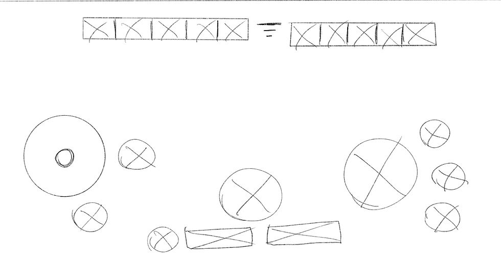


When it comes to creating scamps I like to keep it loose and experimental, making sure to come up with multiple different iterations to try and see what might work and what wont. I wanted to try out a lot of different ideas as this was my first time developing for mobile so I needed to experiment to see what worked rather than focusing on getting an accurate scale on the button sizes I used my scamps as a means to figure out good placement positions.
Low Fidelity - Agent select

Low Fidelity - Advanced Controls


Low Fidelity - basic Controls


Working on the low fidelity wireframes for the player HUD, I refined out my favourite designs from my scamps, this time focusing more on the actual size of each button. Using the research I gathered I created a grid layout in Adobe XD to make sure that each button would be a suitable size (pixels) for the user to comfortably press with their thumbs.
In the background of the wireframes I kept an image representing the thumb zones on mobile so that I could understand if my placement was working before I got into the prototyping stage of development
High Fidelity prototypes
The high fidelity stage of development involved me refining down all the design decisions so far, Understanding what fonts to use, showing the visual hierarchy of each element and overall creating a more polished design for both the agent select screen & the player HUD.
In making the Hi-Fi prototypes it was vital to take Valorant's mechanics into consideration like allowing users to control their spray by turning their fire button into a joystick when they are pressing on it so they can pull down to direct their spray, With the advanced controls allowing users to quickly flick to abilities to activate them to ease some of the cognitive loads of the player.
Small details like these will make allow for a much smoother transition for a PC Valorant player to mobile.